Headings
Use of appropriate Headings is one of the most important aspects of good readability, useful text content structuring and search engine optimisation. Heading styles should always and only be used for the structuring of longer pieces of text content.
This is what Heading 1 looks like
This is what Heading 2 looks like
This is what Heading 3 looks like
This is what Heading 4 looks like
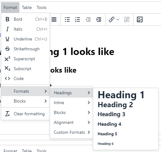
Heading styles are accessed from the Format > Formats > Headings editor menu.

Only Heading 1 to Heading 4 should be used
Heading 1 is the Section name in most page layouts, which appears by default at the top of each main content area. This first level heading is already built in to the design of every page.
Headings 5 and 6 are virtually never required.
Don't skip headings
Use headings in order. Don't put a Heading 4 directly after a Heading 2 for example.
Don't use Heading styles to emphasise text
That's not their purpose. Using headings only to change the size of text for appearance purposes will detract from the accessibility, meaning and maintainability of the page, and have a detrimental effect on SEO.
Instead
Use bold for emphasising a sentence.
Use italic for emphasising a word in a sentence.
Use Formats > Paragraph highlight - maybe with bold.
Use Formats > Button links if the text is short and a call to action:
A content item of Content Type Callout is useful for featuring larger sections of content. A content item of Content Type Callout is useful for featuring larger sections of content. A content item of Content Type Callout is useful for featuring larger sections of content. A content item of Content Type Callout is useful for featuring larger sections of content. A content item of Content Type Callout is useful for featuring larger sections of content.